Seaborn风格可视化
什么是seaborn
Seaborn是基于matplotlib的图形可视化python包。它提供了一种高度交互式界面,便于用户能够做出各种有吸引力的统计图表。Seaborn是在matplotlib的基础上进行了更高级的API封装,从而使得作图更加容易,在大多数情况下使用seaborn能做出很具有吸引力的图,而使用matplotlib就能制作具有更多特色的图。应该把Seaborn视为matplotlib的补充,而不是替代物。同时它能高度兼容numpy与pandas数据结构以及scipy与statsmodels等统计模式。
seaborn API
Seaborn 要求原始数据的输入类型为 pandas 的 Dataframe 或 Numpy 数组,画图函数有以下几种形式:
- sns.图名(x=’X轴 列名’, y=’Y轴 列名’, data=原始数据df对象)
- sns.图名(x=’X轴 列名’, y=’Y轴 列名’, hue=’分组绘图参数’, data=原始数据df对象)
- sns.图名(x=np.array, y=np.array[, …])
1 | import numpy as np |
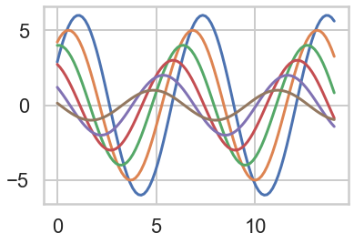
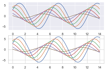
基本绘图设置
1 | # 创建正弦函数 |
简单切换成Seaborn风格
1 | # 切换Seaborn风格 |
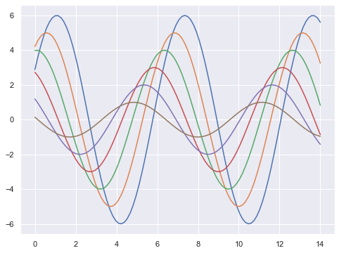
1 | # 切换seaborn图标风格 |
设置图标坐标轴
1 | #despine() |
1 | <matplotlib.axes._subplots.AxesSubplot at 0x1b20e4f7a58> |
设置局部图标风格
1 | with sns.axes_style("darkgrid"): |
设置显示比例
1 | #set_context() |

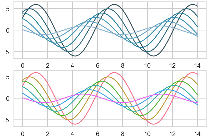
调色板
1 | # color_palette() |
1 | <class 'seaborn.palettes._ColorPalette'> |

颜色风格
1 | # 颜色风格内容:Accent, Accent_r, Blues, Blues_r, BrBG, BrBG_r, BuGn, BuGn_r, BuPu, |


设置饱和度和亮度
1 | sns.palplot(sns.hls_palette(4,l=.3,s=.8)) |

设置颜色线性变化
1 | #设置颜色线性变化 |


创建分散颜色
1 | plt.figure(figsize = (8,6)) |
1 | <matplotlib.axes._subplots.AxesSubplot at 0x1b21a370cf8> |
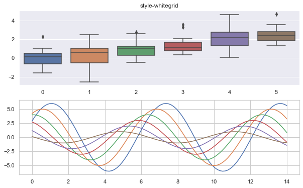
1 | sns.set_style('whitegrid') |
1 | sns.set_style('darkgrid') |
分布数据可视化
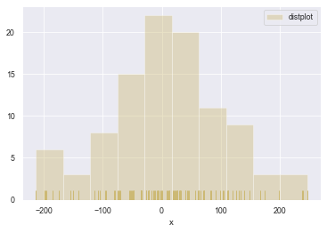
直方图
1 | #直方图 |
1 | <matplotlib.legend.Legend at 0x1b20e65e4e0> |
1 | sns.distplot(s, rug=True, rug_kws={'color':'g'}, |
1 | <matplotlib.axes._subplots.AxesSubplot at 0x1b21bc8e828> |

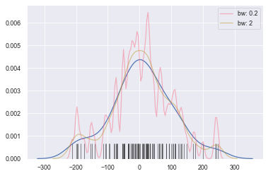
密度图
1 | # 密度图 - kdeplot() |
1 | <matplotlib.axes._subplots.AxesSubplot at 0x1b21babf470> |
1 | # 密度图 - kdeplot() |
1 | <matplotlib.axes._subplots.AxesSubplot at 0x1b21bb63470> |
1 | # 密度图 - kdeplot() |
1 | <matplotlib.axes._subplots.AxesSubplot at 0x1b21be56278> |
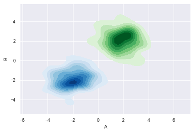
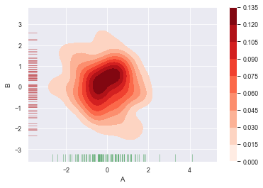
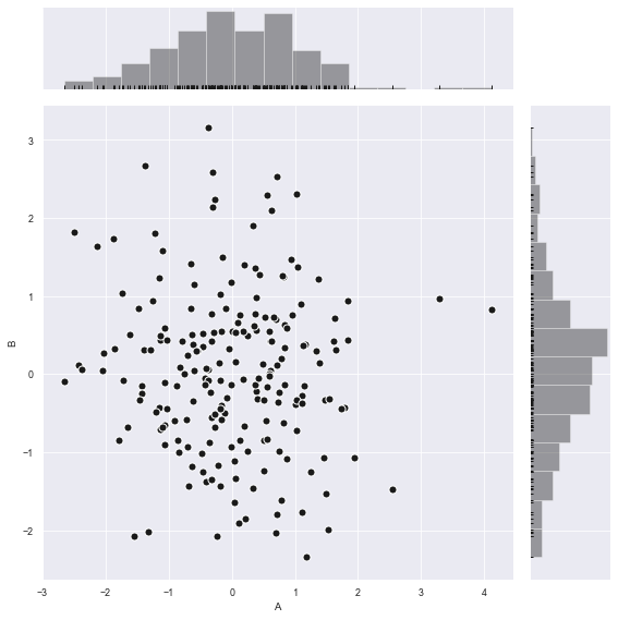
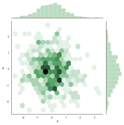
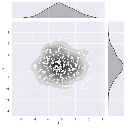
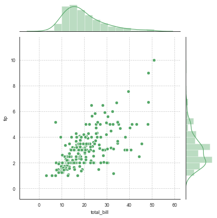
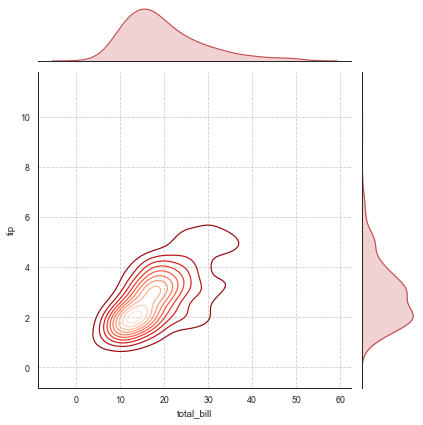
综合散点图
1 | # 综合散点图 - jointplot() |
1 | <seaborn.axisgrid.JointGrid at 0x1b21bee2be0> |
1 | # 综合散点图 - jointplot() |
1 | # 综合散点图 - jointplot() |
1 | <seaborn.axisgrid.JointGrid at 0x1b21c4325f8> |
1 | # 综合散点图 - JointGrid() |
1 | total_bill tip sex smoker day time size |
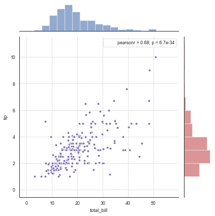
1 | # 综合散点图 - JointGrid() |
1 | <seaborn.axisgrid.JointGrid at 0x1b21c630da0> |
1 | # 综合散点图 - JointGrid() |
1 | <seaborn.axisgrid.JointGrid at 0x1b21d7aef60> |
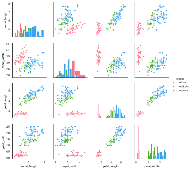
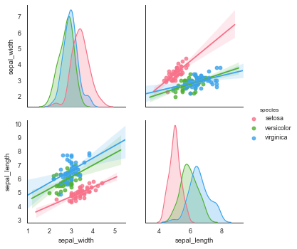
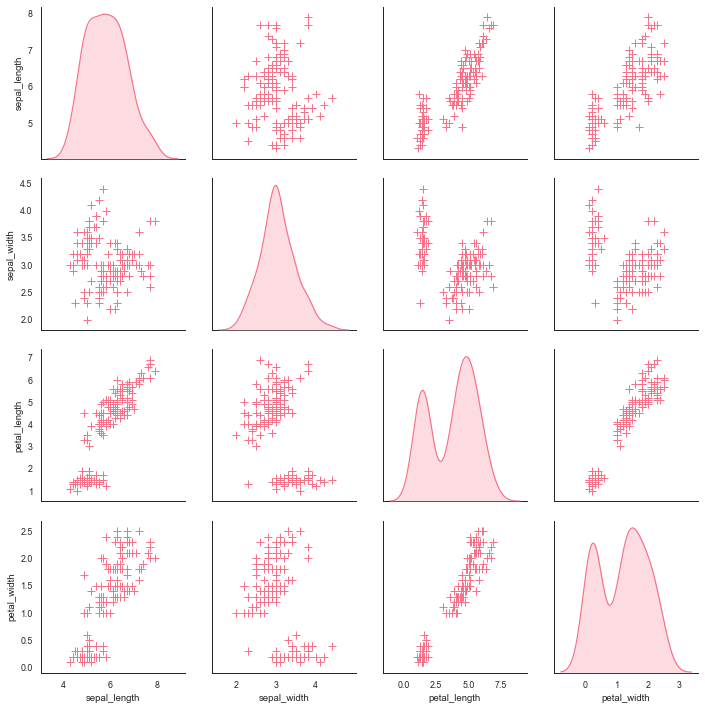
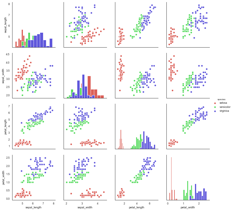
矩阵散点图
1 | # 矩阵散点图 - pairplot() |
1 | sepal_length sepal_width petal_length petal_width species |
1 | <seaborn.axisgrid.PairGrid at 0x1b21d8a44e0> |
1 | # 矩阵散点图 - pairplot() |
1 | <seaborn.axisgrid.PairGrid at 0x1b21e003c18> |
1 | # 矩阵散点图 - pairplot() |
1 | <seaborn.axisgrid.PairGrid at 0x1b21c37be48> |
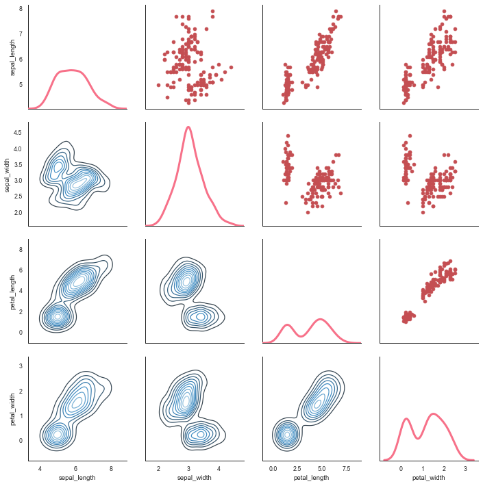
1 | # 矩阵散点图 - PairGrid() |
1 | <seaborn.axisgrid.PairGrid at 0x1b218fe3f98> |
1 | # 矩阵散点图 - PairGrid() |
1 | <seaborn.axisgrid.PairGrid at 0x1b21ee966a0> |
分类数据可视化
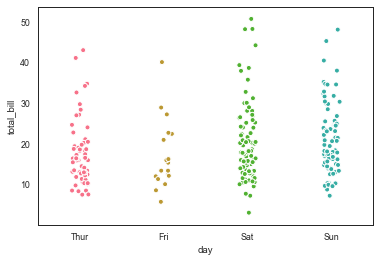
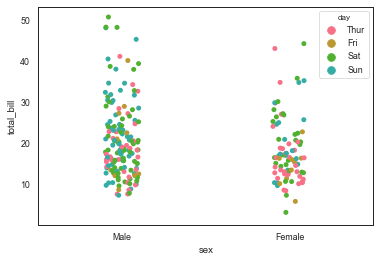
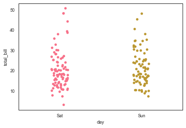
分类散点图
1 | # stripplot() |
1 | total_bill tip sex smoker day time size |
1 | <matplotlib.axes._subplots.AxesSubplot at 0x1b21f971320> |
1 | # stripplot() |
1 | <matplotlib.axes._subplots.AxesSubplot at 0x1b21f9b2b00> |
1 | # stripplot() |
1 | <matplotlib.axes._subplots.AxesSubplot at 0x1b21fc11198> |
1 | # stripplot() |
1 | Sat 87 |
1 | <matplotlib.axes._subplots.AxesSubplot at 0x1b21fc8c748> |
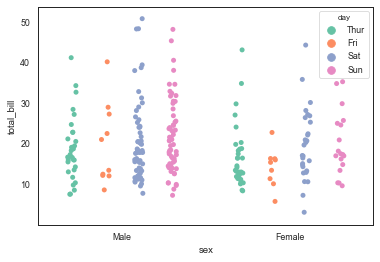
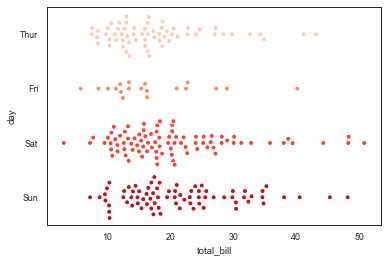
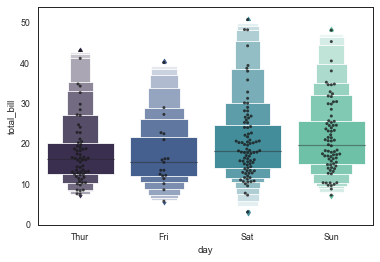
分簇散点图
1 | # swarmplot() |
1 | <matplotlib.axes._subplots.AxesSubplot at 0x1b21fcdef28> |
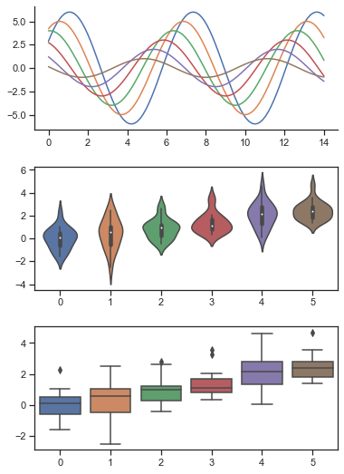
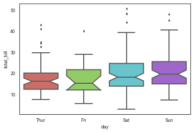
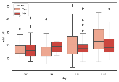
箱型图
1 | # boxplot() |
1 | <matplotlib.axes._subplots.AxesSubplot at 0x1b21fd32710> |
1 | # 通过hue参数再分类 |
1 | <matplotlib.axes._subplots.AxesSubplot at 0x1b21fdce5c0> |
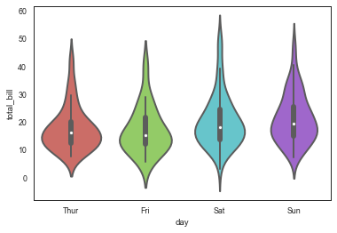
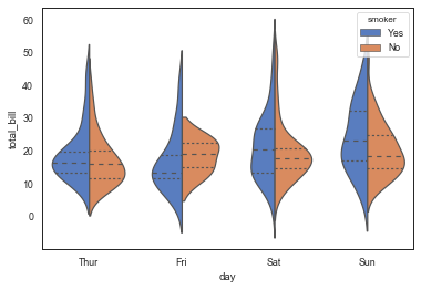
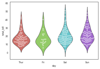
小提琴图
1 | # violinplot() |
1 | <matplotlib.axes._subplots.AxesSubplot at 0x1b21feb0d68> |
1 | # 通过hue参数再分类 |
1 | <matplotlib.axes._subplots.AxesSubplot at 0x1b21ff37940> |
1 | # 结合散点图 |
1 | <matplotlib.axes._subplots.AxesSubplot at 0x1b21fff0e80> |
LV图
1 | # lvplot() |
1 | <matplotlib.axes._subplots.AxesSubplot at 0x1b22101c400> |
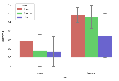
分类统计图
1 | # barplot() |
1 | <matplotlib.axes._subplots.AxesSubplot at 0x1b2210a1048> |
1 | # barplot() |
| total_bill | tip | size | ||
|---|---|---|---|---|
| day | sex | |||
| Thur | Male | 18.714667 | 2.980333 | 2.433333 |
| Female | 16.715312 | 2.575625 | 2.468750 | |
| Fri | Male | 19.857000 | 2.693000 | 2.100000 |
| Female | 14.145556 | 2.781111 | 2.111111 | |
| Sat | Male | 20.802542 | 3.083898 | 2.644068 |
| Female | 19.680357 | 2.801786 | 2.250000 | |
| Sun | Male | 21.887241 | 3.220345 | 2.810345 |
| Female | 19.872222 | 3.367222 | 2.944444 |
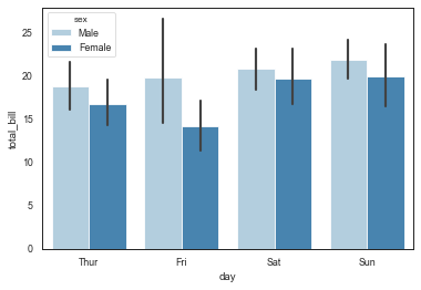
1 | # 1、barplot() |
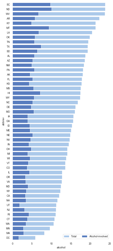
1 | total speeding alcohol not_distracted no_previous ins_premium \ |
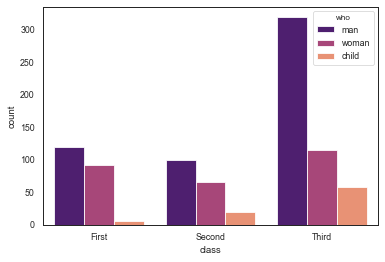
1 | # countplot() |
1 | <matplotlib.axes._subplots.AxesSubplot at 0x1b22117aac8> |
1 | # pointplot() |
1 | time smoker |

线性数据可视化
基本使用
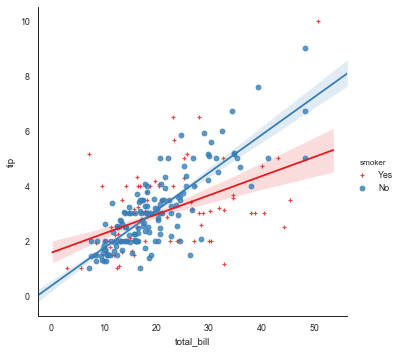
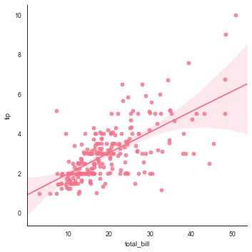
1 | # 基本用法 |
1 | total_bill tip sex smoker day time size |
1 | <seaborn.axisgrid.FacetGrid at 0x1b21c57d7b8> |
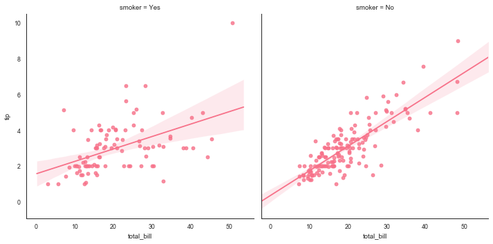
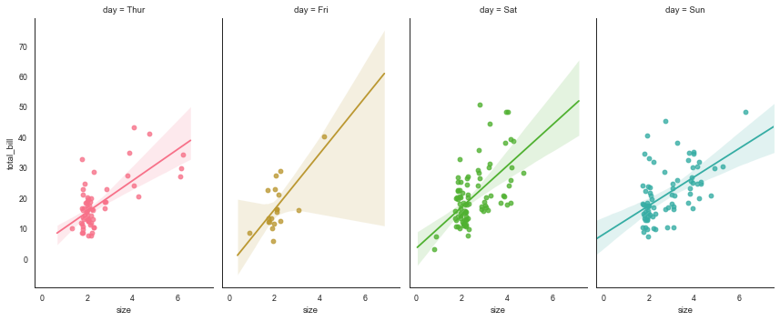
多表格
1 | sns.lmplot(x="total_bill", y="tip", col="smoker", data=tips) |
1 | <seaborn.axisgrid.FacetGrid at 0x1b2215774e0> |
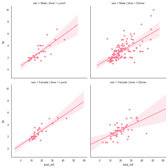
1 | # 多图表1 |
1 | <seaborn.axisgrid.FacetGrid at 0x1b2216276a0> |
1 | # 多图表2 |
1 | <seaborn.axisgrid.FacetGrid at 0x1b22160a400> |
非线性回归
1 | # 非线性回归 |
1 | <seaborn.axisgrid.FacetGrid at 0x1b2214d7b00> |
其他图表可视化
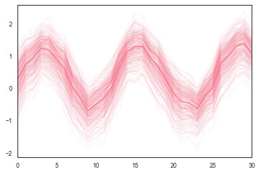
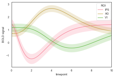
时间线图
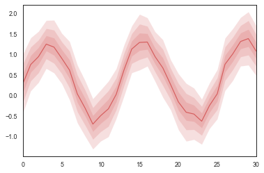
1 | # tsplot() |
1 | <matplotlib.axes._subplots.AxesSubplot at 0x1b21668c860> |
1 | sns.tsplot(data=data, err_style="boot_traces", |
1 | <matplotlib.axes._subplots.AxesSubplot at 0x1b216533048> |
1 | gammas = sns.load_dataset("gammas") |
1 | timepoint ROI subject BOLD signal |
1 | <matplotlib.axes._subplots.AxesSubplot at 0x1b221f95a58> |
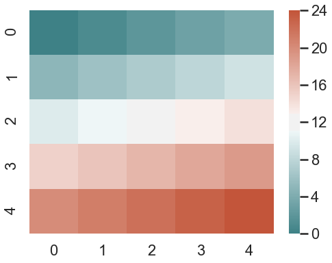
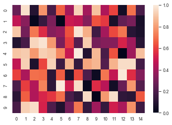
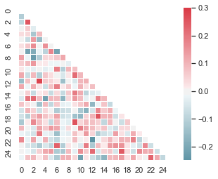
热图
1 | # 热图 - heatmap() |
1 | <matplotlib.axes._subplots.AxesSubplot at 0x1b221faac88> |
1 | # heatmap() |
1 | <matplotlib.axes._subplots.AxesSubplot at 0x1b223040588> |
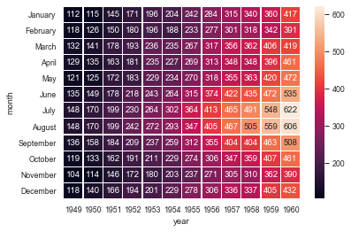
1 | # heatmap() |
1 | <matplotlib.axes._subplots.AxesSubplot at 0x1b2231f3128> |
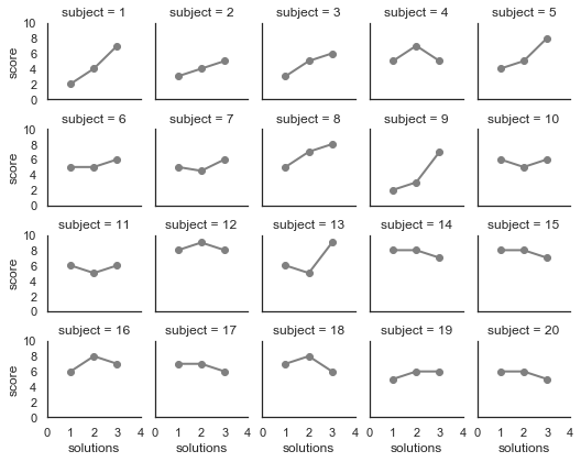
图标矩阵
1 | attend = sns.load_dataset("attention") |
1 | Unnamed: 0 subject attention solutions score |
1 | <seaborn.axisgrid.FacetGrid at 0x1b22328cb00> |