Matplotlib的基本用法
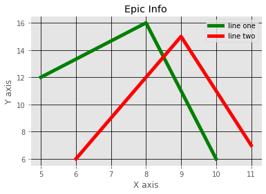
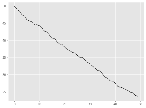
简单的折线图
plt.plot(x,y, fortmat_string)
作用是定义画图的样式
x,y表示横纵左表, format可以定义画图格式
1 | #导入Matploylib库 |
添加标题标签及图的样式
1 | from matplotlib import pyplot as plt |
1 | from matplotlib import pyplot as plt |
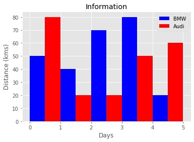
直方图
pyplot.bar(left, height, alpha=1, width=0.8, color=, edgecolor=, label=, lw=3)
画一个柱状图
参数
- left: x轴的位置序列,一般采用arange函数产生一个序列
- height: y轴的数值序列,也就是柱状图的高度,即我们需要展示的数据
- alpha: 透明度
- width: 柱状图的宽度
- color or facecolor: 柱状图的填充颜色
- edgecolor: 图形边缘颜色
- label: 每个图像代表的意思
- linewidth or linewidths or lw:边缘or线的宽度
1 | from matplotlib import pyplot as plt |
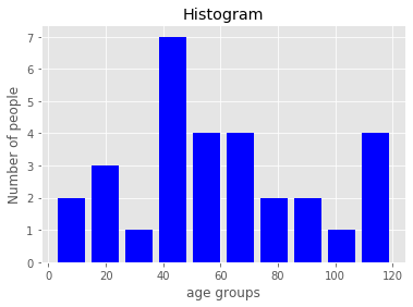
频率图
matplotlib.pyplot.hist(x, bins=10, range=None, normed=False, weights=None, cumulative=False, bottom=None, histtype=u’bar’, align=u’mid’, orientation=u’vertical’, rwidth=None, log=False, color=None, label=None, stacked=False)
统计每个区间出现的频率
参数
- x:直方图统计的数据
- bins: 指定统计的间隔,如bins=10时表示以10为一个区间
- color: 柱状图的颜色
- histtype: 可选{‘bar’, ‘barstacked’,’step’, ‘stepfilled’}之一
- density: 显示频率
- stacked: 是否显示堆叠柱状图
1 | import matplotlib.pyplot as plt |
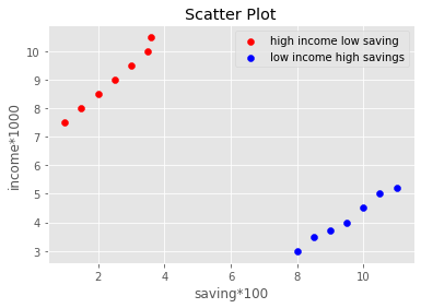
散点图
1 | import matplotlib.pyplot as plt |
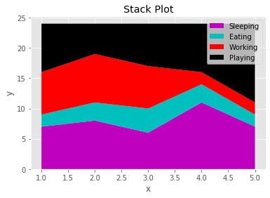
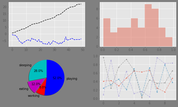
堆叠图
matplotlib.pyplot.stackplot(x, args, labels=(), colors=None, baseline=’zero’, data=None, *kwargs)
画堆叠图,主要有三个参数
- x:需要画堆叠图的数值
- laebl: 堆叠图中折现的标签
- colors: 设置折线图的颜色
1 | sleeping =[7,8,6,11,7] |
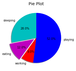
饼状图
1 | slices = [7,3,2,13] |
多个子图合并
plt.subplot(numRows, numCols, plotNum)
将一块画布分为多个区域,将不同图分别放入不同的子图
参数
- numRows:指的行数
- numCols:指的列数
- plotNum:子图的位置
如上面所示的221,表示的是将图分为2 * 2个子图,然后使用第一个位置
子图的位置依次为
1 | (1,1) (1,2) |
依次对应的位置为1,2,3,4
1 | import numpy as np |

pandas与matplotlib结合
1 | import pandas as pd |
np.random.rand(nums)
随即产生nums个位于[0,1]的样本
np.random.randn(nums)
随即返回nums个标准正态分布的样本
1 | plt.plot(np.random.rand(10)) |
1 | [<matplotlib.lines.Line2D at 0x24f3122c2b0>] |
设置坐标轴刻度
- 图名
- x轴标签
- y轴标签
- 图例
- x轴边界
- y轴边界
- x轴刻度
- y轴刻度
- x轴刻度标签
- y轴刻度标签
1 | df = pd.DataFrame(np.random.rand(10,2),columns=['A','B']) |
1 | [Text(0, 0, '0.00'), |
修改图标样式
pd.Series()作用是产生一个有编号的序列
np.random.randn()产生正太分布的样本,当只有一个参数是,返回n个标准正太分布的结果,当有两个或多个参数时,参数表示对应的维度
np.random.rand() 用法和上面一个函数一样,但是返回的是
np.cumsum()表示将前一行或者前一列加到后面
参数
a:表示传入函数的数据
axi:{0,1},axi=0时表示行相加,axi=1时表示列相加
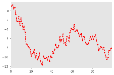
1 | s = pd.Series(np.random.randn(100).cumsum()) |
dataframe直接画图
DataFrame.plot(x=None, y=None, kind=’line’, ax=None, subplots=False,
sharex=None, sharey=False, layout=None,figsize=None,
use_index=True, title=None, grid=None, legend=True,
style=None, logx=False, logy=False, loglog=False,
xticks=None, yticks=None, xlim=None, ylim=None, rot=None,
xerr=None,secondary_y=False, sort_columns=False, **kwds)
Parameters:
x : label or position, default None#指数据框列的标签或位置参数
y : label or position, default None
kind : str
‘line’ : line plot (default)#折线图
‘bar’ : vertical bar plot#条形图
‘barh’ : horizontal bar plot#横向条形图
‘hist’ : histogram#柱状图
‘box’ : boxplot#箱线图
‘kde’ : Kernel Density Estimation plot#Kernel 的密度估计图,主要对柱状图添加Kernel 概率密度线
‘density’ : same as ‘kde’
‘area’ : area plot#不了解此图
‘pie’ : pie plot#饼图
‘scatter’ : scatter plot#散点图 需要传入columns方向的索引
‘hexbin’ : hexbin plot#不了解此图
ax : matplotlib axes object, default None#子图(axes, 也可以理解成坐标轴) 要在其上进行绘制的matplotlib subplot对象。如果没有设置,则使用当前matplotlib subplot其中,变量和函数通过改变figure和axes中的元素(例如:title,label,点和线等等)一起描述figure和axes,也就是在画布上绘图。
- subplots : boolean, default False#判断图片中是否有子图
Make separate subplots for each column
- sharex : boolean, default True if ax is None else False#如果有子图,子图共x轴刻度,标签
In case subplots=True, share x axis and set some x axis labels to invisible; defaults to True if ax is None otherwise False if an ax is passed in; Be aware, that passing in both an ax and sharex=True will alter all x axis labels for all axis in a figure!
- sharey : boolean, default False#如果有子图,子图共y轴刻度,标签
In case subplots=True, share y axis and set some y axis labels to invisible
- layout : tuple (optional)#子图的行列布局
(rows, columns) for the layout of subplots
figsize : a tuple (width, height) in inches#图片尺寸大小
use_index : boolean, default True#默认用索引做x轴
Use index as ticks for x axis
- title : string#图片的标题用字符串
Title to use for the plot
- grid : boolean, default None (matlab style default)#图片是否有网格
Axis grid lines
- legend : False/True/’reverse’#子图的图例,添加一个subplot图例(默认为True)
Place legend on axis subplots
- style : list or dict#对每列折线图设置线的类型
matplotlib line style per column
- logx : boolean, default False#设置x轴刻度是否取对数
Use log scaling on x axis
- logy : boolean, default False
Use log scaling on y axis
- loglog : boolean, default False#同时设置x,y轴刻度是否取对数
Use log scaling on both x and y axes
- xticks : sequence#设置x轴刻度值,序列形式(比如列表)
Values to use for the xticks
- yticks : sequence#设置y轴刻度,序列形式(比如列表)
Values to use for the yticks
xlim : 2-tuple/list#设置坐标轴的范围,列表或元组形式
ylim : 2-tuple/list
rot : int, default None#设置轴标签(轴刻度)的显示旋转度数
Rotation for ticks (xticks for vertical, yticks for horizontal plots)
- fontsize : int, default None#设置轴刻度的字体大小
Font size for xticks and yticks
- colormap : str or matplotlib colormap object, default None#设置图的区域颜色
Colormap to select colors from. If string, load colormap with that name from matplotlib.
- colorbar : boolean, optional #图片柱子
If True, plot colorbar (only relevant for ‘scatter’ and ‘hexbin’ plots)
- position : float
Specify relative alignments for bar plot layout. From 0 (left/bottom-end) to 1 (right/top-end). Default is 0.5 (center)
- layout : tuple (optional) #布局
(rows, columns) for the layout of the plot
- table : boolean, Series or DataFrame, default False #如果为正,则选择DataFrame类型的数据并且转换匹配matplotlib的布局。
If True, draw a table using the data in the DataFrame and the data will be transposed to meet matplotlib’s default layout. If a Series or DataFrame is passed, use passed data to draw a table.
- yerr : DataFrame, Series, array-like, dict and str
See Plotting with Error Bars for detail.
xerr : same types as yerr.
stacked : boolean, default False in line and
bar plots, and True in area plot. If True, create stacked plot.
sort_columns : boolean, default False # 以字母表顺序绘制各列,默认使用前列顺序
secondary_y : boolean or sequence, default False ##设置第二个y轴(右y轴)
Whether to plot on the secondary y-axis If a list/tuple, which columns to plot on secondary y-axis
- mark_right : boolean, default True
When using a secondary_y axis, automatically mark the column labels with “(right)” in the legend
- kwds : keywords
Options to pass to matplotlib plotting method
Returns:axes : matplotlib.AxesSubplot or np.array of them
1 | # 直接用风格样式设置 |
1 | <matplotlib.axes._subplots.AxesSubplot at 0x24f379a4cc0> |
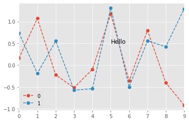
1 | df = pd.DataFrame(np.random.randn(10,2)) |
1 | Text(5, 0.5, 'Hello') |
子图绘制
figure对象
plt.figure(num=None, figsize=None, dpi=None, facecolor=None, edgecolor=None, frameon=True, FigureClass=
作用创建一块画布
num相当于id,如果没有id则递增创建,如果已存在则返回该存在的对象
1 | fig1 = plt.figure(num=1,figsize=(8,6)) |
1 | [<matplotlib.lines.Line2D at 0x24f3780f6d8>] |
先创建子图然后填充
1 | # 先建立子图然后填充图表 |
1 | [<matplotlib.lines.Line2D at 0x24f38c19940>, |
使用subplots子图数组填充子图
1 | # 创建一个新的figure,并返回一个subplot对象的numpy数组 → plt.subplot |
1 | [[<matplotlib.axes._subplots.AxesSubplot object at 0x0000024F38EFABA8> |
1 | [<matplotlib.lines.Line2D at 0x24f38d39978>] |
1 | # plt.subplots 参数调整 |
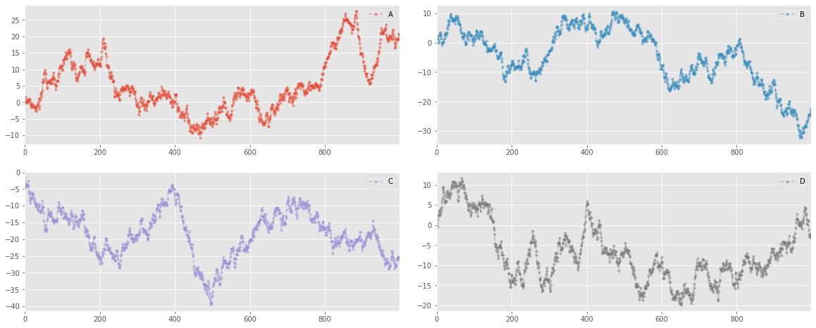
多系列子图绘制
plt.plot():
- subplots, 是否分别绘制子图,为true的时候表示分开绘制,为false表示在一个图立面绘制
- layout:挥之子图矩阵,按顺序填充
subplots_adjust(left=None, bottom=None, right=None, top=None, wspace=None, hspace=None)
有六个可选参数来控制子图布局。值均为0~1之间。其中left、bottom、right、top围成的区域就是子图的区域。wspace、hspace分别表示子图之间左右、上下的间距。实际的默认值由matplotlibrc文件控制的。
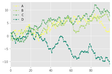
1 | df = pd.DataFrame(np.random.randn(1000, 4), index=ts.index, columns=list('ABCD')) |
基本图表绘制
Series 与 DataFrame 绘图
plt.plot(kind=’line’, ax=None, figsize=None, use_index=True, title=None, grid=None, legend=False,
style=None, logx=False, logy=False, loglog=False, xticks=None, yticks=None, xlim=None, ylim=None,
rot=None, fontsize=None, colormap=None, table=False, yerr=None, xerr=None, label=None, secondary_y=False, **kwds)
参数含义:
- series的index为横坐标
- value为纵坐标
- kind → line,bar,barh…(折线图,柱状图,柱状图-横…)
- label → 图例标签,Dataframe格式以列名为label
- style → 风格字符串,这里包括了linestyle(-),marker(.),color(g)
- color → 颜色,有color指定时候,以color颜色为准
- alpha → 透明度,0-1
- use_index → 将索引用为刻度标签,默认为True
- rot → 旋转刻度标签,0-360
- grid → 显示网格,一般直接用plt.grid
- xlim,ylim → x,y轴界限
- xticks,yticks → x,y轴刻度值
- figsize → 图像大小
- title → 图名
- legend → 是否显示图例,一般直接用plt.legend()
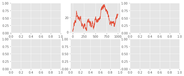
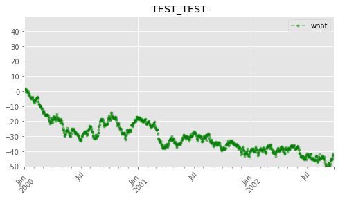
1 | ts = pd.Series(np.random.randn(1000), index=pd.date_range('1/1/2000', periods=1000)) # pandas 时间序列 |
1 | # subplots → 是否将各个列绘制到不同图表,默认False |
1 | <matplotlib.axes._subplots.AxesSubplot at 0x24f32b0f630> |

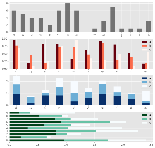
柱状图
- plt.bar()
- x,y参数:x,y值
- width:宽度比例
- facecolor柱状图里填充的颜色、edgecolor是边框的颜色
- left-每个柱x轴左边界,bottom-每个柱y轴下边界 → bottom扩展即可化为甘特图 Gantt Chart
- align:决定整个bar图分布,默认left表示默认从左边界开始绘制,center会将图绘制在中间位置
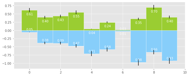
xerr/yerr :x/y方向error bar
1 | # 创建一个新的figure,并返回一个subplot对象的numpy数组 |
1 | <matplotlib.axes._subplots.AxesSubplot at 0x24f32cf0550> |
1 | plt.figure(figsize=(10,4)) |
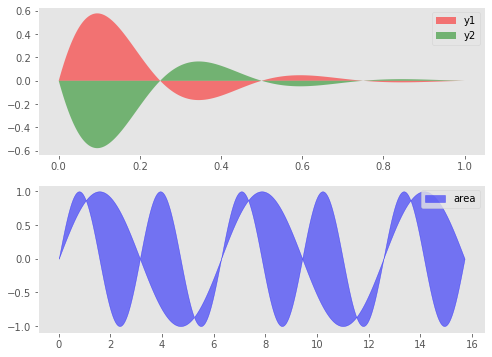
面积图
- stacked:是否堆叠,默认情况下,区域图被堆叠
- 为了产生堆积面积图,每列必须是正值或全部负值!
- 当数据有NaN时候,自动填充0,图标签需要清洗掉缺失值
1 | fig,axes = plt.subplots(2,1,figsize = (8,6)) |
1 | <matplotlib.axes._subplots.AxesSubplot at 0x24f3288f668> |
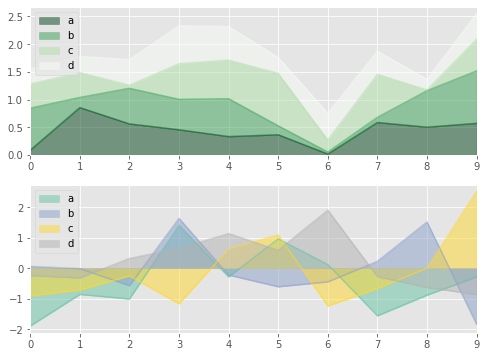
填图
1 | fig,axes = plt.subplots(2,1,figsize = (8,6)) |
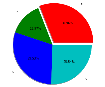
饼图
plt.pie(x, explode=None, labels=None, colors=None, autopct=None, pctdistance=0.6, shadow=False, labeldistance=1.1, startangle=None, radius=None, counterclock=True, wedgeprops=None, textprops=None, center=(0, 0), frame=False, hold=None, data=None)
- 参数含义:
- 第一个参数:数据
- explode:指定每部分的偏移量
- labels:标签
- colors:颜色
- autopct:饼图上的数据标签显示方式
- pctdistance:每个饼切片的中心和通过autopct生成的文本开始之间的比例
- labeldistance:被画饼标记的直径,默认值:1.1
- shadow:阴影
- startangle:开始角度
- radius:半径
- frame:图框
- counterclock:指定指针方向,顺时针或者逆时针
1 | s = pd.Series(3 * np.random.rand(4), index=['a', 'b', 'c', 'd'], name='series') |
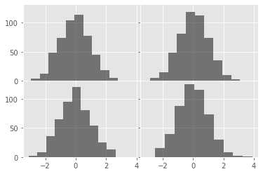
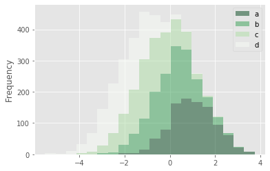
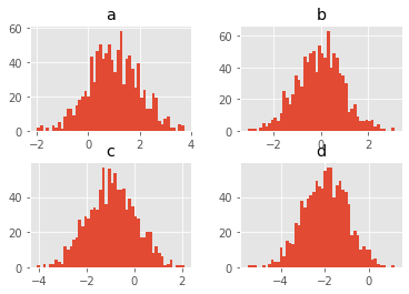
直方图
plt.hist(x, bins=10, range=None, normed=False, weights=None, cumulative=False, bottom=None,
histtype=’bar’, align=’mid’, orientation=’vertical’,rwidth=None, log=False, color=None, label=None,
stacked=False, hold=None, data=None, **kwargs)
- 参数
- bin:箱子的宽度
- normed 标准化
- histtype 风格,bar,barstacked,step,stepfilled
- orientation 水平还是垂直{‘horizontal’, ‘vertical’}
- align : {‘left’, ‘mid’, ‘right’}, optional(对齐方式)
- stacked:是否堆叠
1 | # 直方图 |
1 | D:\Program Files (x86)\Anaconda3\lib\site-packages\pandas\plotting\_core.py:2477: MatplotlibDeprecationWarning: |

1 | # 堆叠直方图 |
1 | array([[<matplotlib.axes._subplots.AxesSubplot object at 0x0000024F34C1B710>, |
1 | <Figure size 432x288 with 0 Axes> |
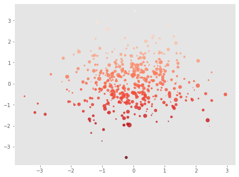
散点图
plt.scatter(x, y, s=20, c=None, marker=’o’, cmap=None, norm=None, vmin=None, vmax=None, alpha=None, linewidths=None,
verts=None, edgecolors=None, hold=None, data=None, **kwargs)
参数含义:
- s:散点的大小
- c:散点的颜色
- vmin,vmax:亮度设置,标量
- cmap:colormap
1 | plt.figure(figsize=(8,6)) |
1 | D:\Program Files (x86)\Anaconda3\lib\site-packages\matplotlib\collections.py:857: RuntimeWarning: invalid value encountered in sqrt |
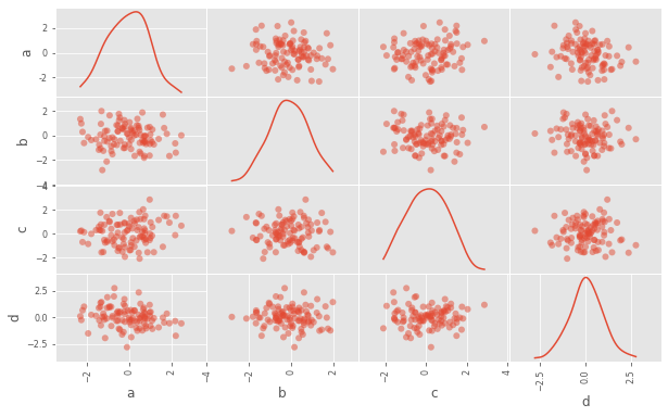
1 | # pd.scatter_matrix()散点矩阵 |
1 | array([[<matplotlib.axes._subplots.AxesSubplot object at 0x0000024F39EB5828>, |
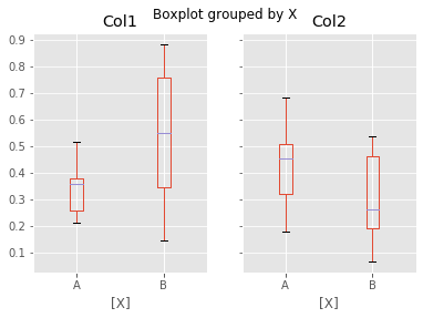
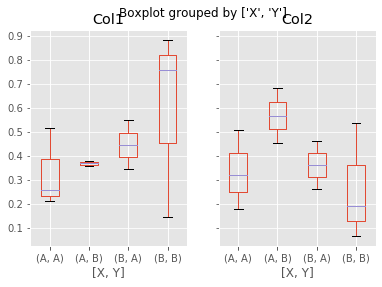
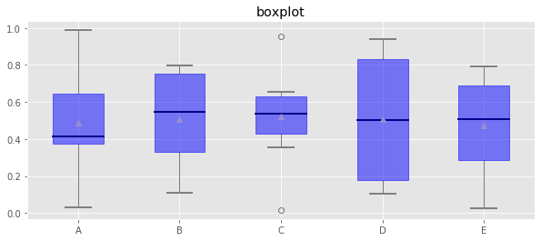
箱型图
箱型图:又称为盒须图、盒式图、盒状图或箱线图,是一种用作显示一组数据分散情况资料的统计图
包含一组数据的:最大值、最小值、中位数、上四分位数(Q1)、下四分位数(Q3)、异常值
① 中位数 → 一组数据平均分成两份,中间的数
② 下四分位数Q1 → 是将序列平均分成四份,计算(n+1)/4与(n-1)/4两种,一般使用(n+1)/4
③ 上四分位数Q3 → 是将序列平均分成四份,计算(1+n)/4*3=6.75
④ 内限 → T形的盒须就是内限,最大值区间Q3+1.5IQR,最小值区间Q1-1.5IQR (IQR=Q3-Q1)
⑤ 外限 → T形的盒须就是内限,最大值区间Q3+3IQR,最小值区间Q1-3IQR (IQR=Q3-Q1)
⑥ 异常值 → 内限之外 - 中度异常,外限之外 - 极度异常
plt.plot.box(),plt.boxplot()
1 | # plt.plot.box()绘制 |
1 | <matplotlib.axes._subplots.AxesSubplot at 0x24f394cc9b0> |
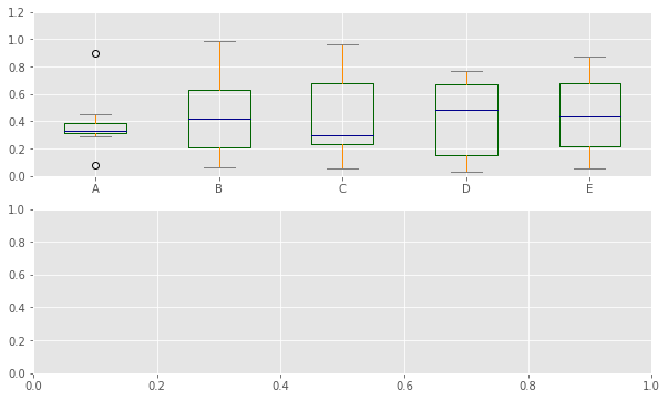
1 | df = pd.DataFrame(np.random.rand(10, 5), columns=['A', 'B', 'C', 'D', 'E']) |
1 | # plt.boxplot()绘制 |
1 | array([<matplotlib.axes._subplots.AxesSubplot object at 0x0000024F3519AD68>, |